Founded in 1973, RE/MAX is an American international real estate company with over 100,000 agents in 6,800 offices within 100 countries. Operating through a franchise system, the company has held the number one position in residential transactions in the United States and Canada since 1999. In 2016, RE/MAX was recognized as the top real estate franchise in the annual Franchise 500 survey by Entrepreneur magazine, having held this position for 13 out of 17 years.
While known within the industry for its commitment to employee development and support, by 2013 RE/MAX's intranet team had recognized that, over the course of several years, the corporate intranet had become decentralized and was in need of an overhaul

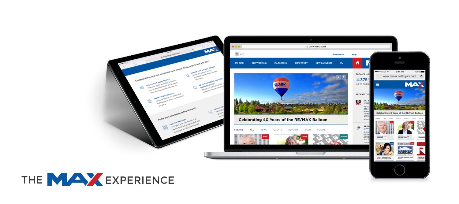
In the Fall of 2013, I joined the team at Theresa Neil Strategy + Design to lead UX Design of an interactive "concept car" showcasing the vision for a redesigned and revamped RE/MAX corporate intranet.
We had been contracted by an internal team looking to use the demo in presenting a formal project proposal to internal stakeholders and executives for a multi-year intranet redesign/re-architecture project. The focus of the demo would be in demonstrating how a streamlined, responsive, and fully integrated multi-platform intranet experience would increase productivity and effectiveness of on-the-go brokers and agents.

Though we had a short timeline to conceive, design, we had the benefit of a wealth of qualitative and quantitative user data gathered by the RE/MAX team providing valuable insight into Agent and Broker needs, expectations, behavior, and context for use, as well as usability issues, requested new features, and areas requiring improvement.
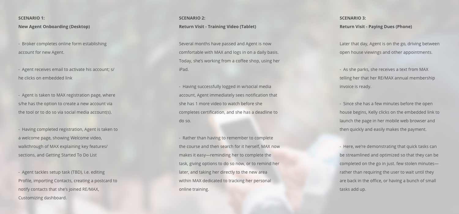
The first challenge was in defining compelling Personas and Scenarios that would address the key benefits of a centralized, responsive RE/MAX intranet without extending the presentation beyond our 1-hour time limit.
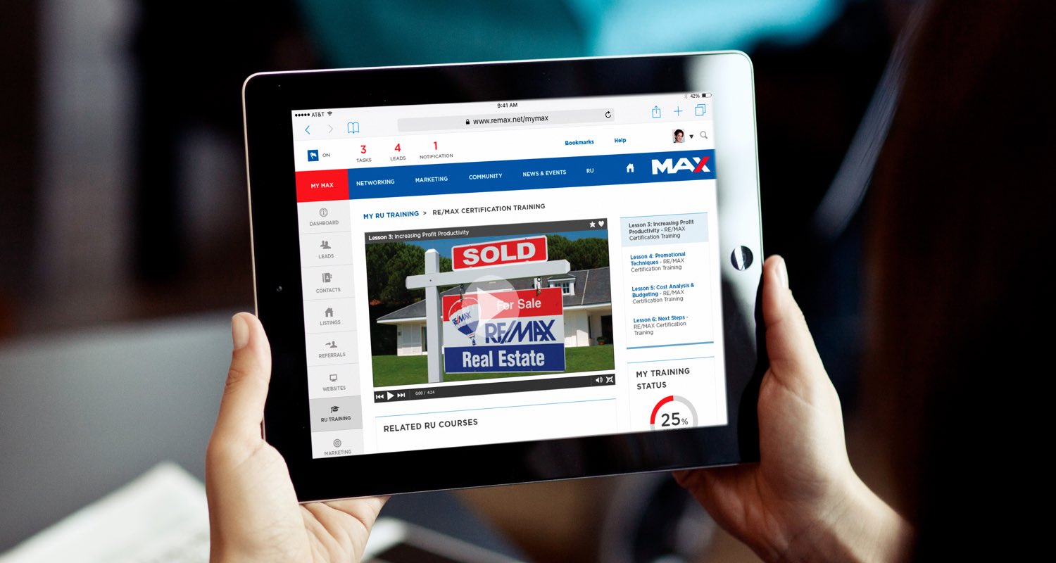
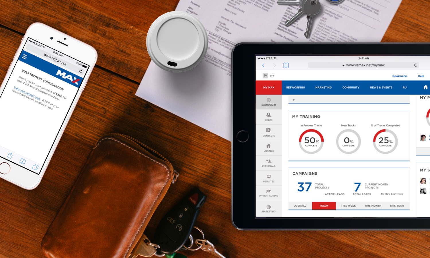
While we had hoped to present both Agent and Broker scenarios within the demo, we quickly saw how doing so would complicate the narrative and likely push the demo outside of an hour. Therefore, we included the Broker as the initiator of the Agent onboarding process, but directed focus to the Agent experience where we felt we could demonstrate more value. We targeted the initial onboarding experience, as well as the Agent's evolving needs for training and certification as she gained experience in the field.


The next challenge was in developing an intuitive new architecture that demonstrated how siloed intranet sites could be consolidated and centralized for a demo, without getting bogged down in the details that I would normally address in an actual rearchitecture project.
In order to facilitate the process, I conducted informal competitive research - reaching out to friends and colleagues in the industry, running simple search queries and reviewing real estate sites within intranet annuals - to gather information about competitor intranets and how they were structured. Using the navigational models I had assembled as a reference point, I determined what categories could be leveraged by RE/MAX, and which new categories needed to be created to match their specific needs, as well as those of their Agent and Broker users.
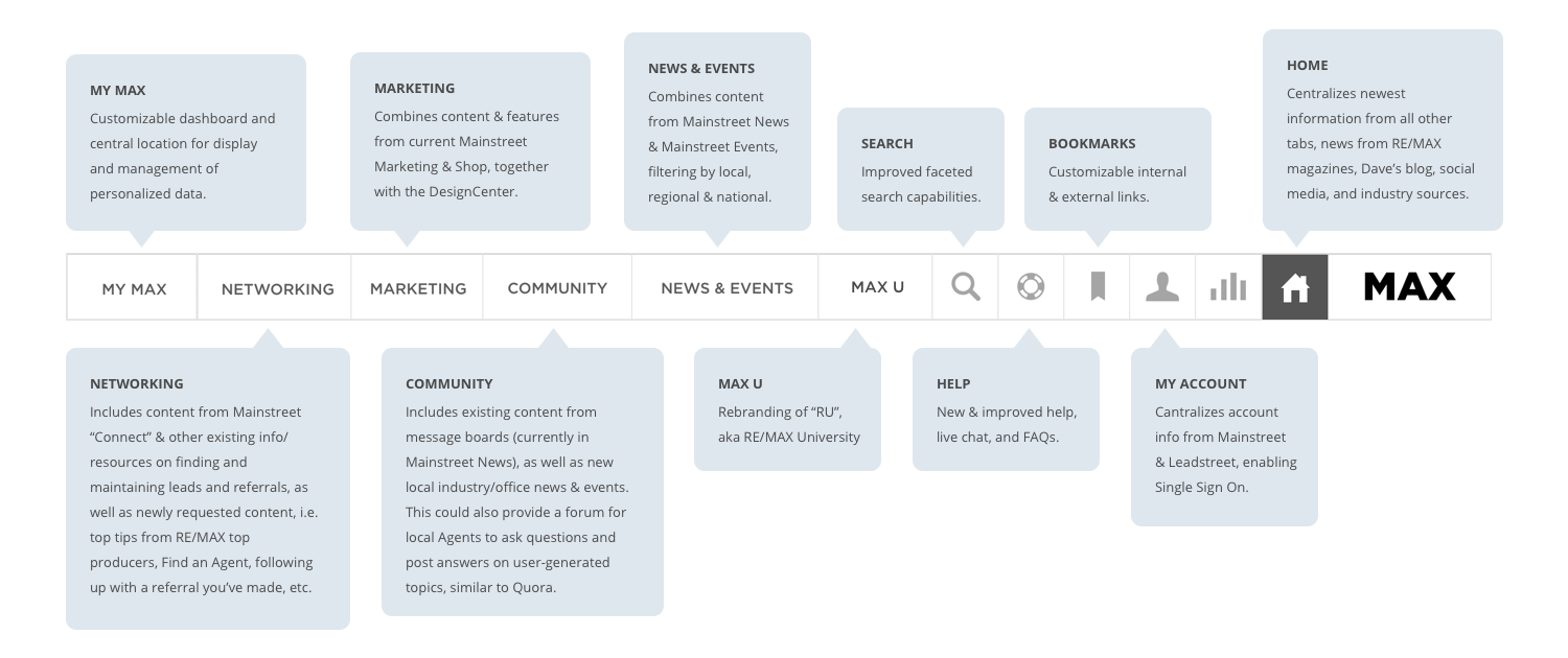
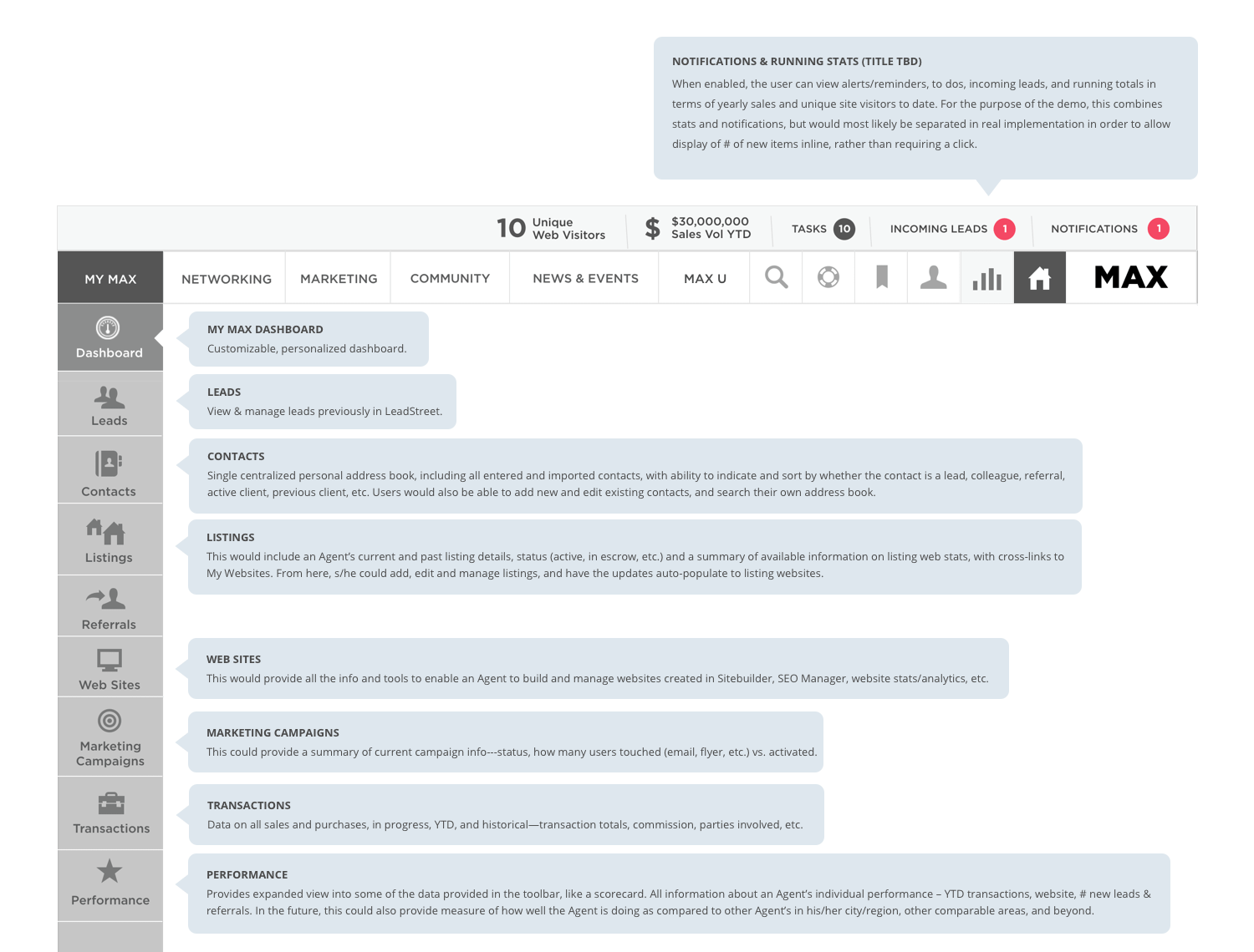
Having iteratively refined and finalized the demo scenarios, running a screen count and time estimates to ensure that the final demo would be able to be presented comfortably within an hour, I moved on to wireframing the demo screen by screen, interaction by interaction.
As UX Design and Visual Design Sprints were running concurrently, I worked closely with the Visual Designer that all deliverables presented to the client were aligned and in sync.
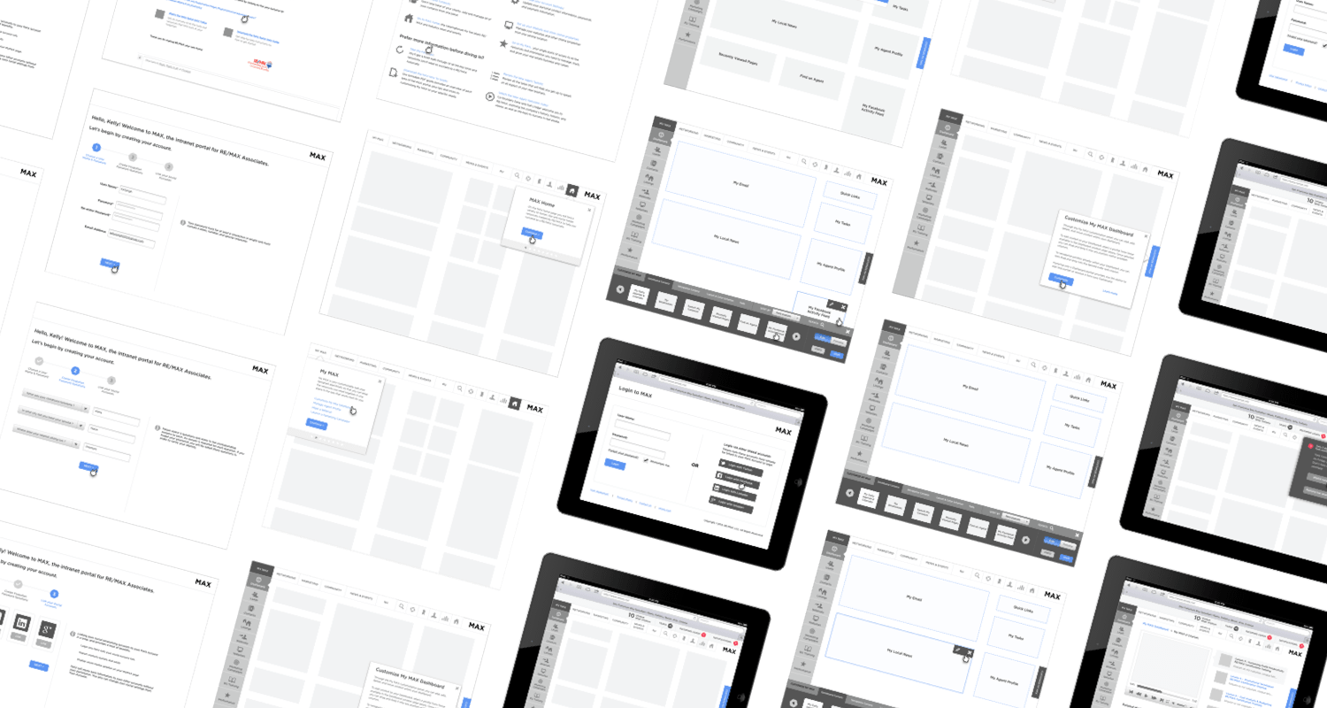
Once high-level screens were finalized, I handed off to the Visual Designer to address the details, while switching to the task of creating the Demo Storyboard and Script. While our team would present the first demo, subsequent demos were to be presented by RE/MAX team members to different internal audiences. Therefore, it was important to craft a free-standing script that was clear and concise for guided presentation, while thorough in providing supplemental explanatory information. No matter who was presenting, the script would equip the presenter with answer to any questions that might arise regarding new navigation and features within the demo.
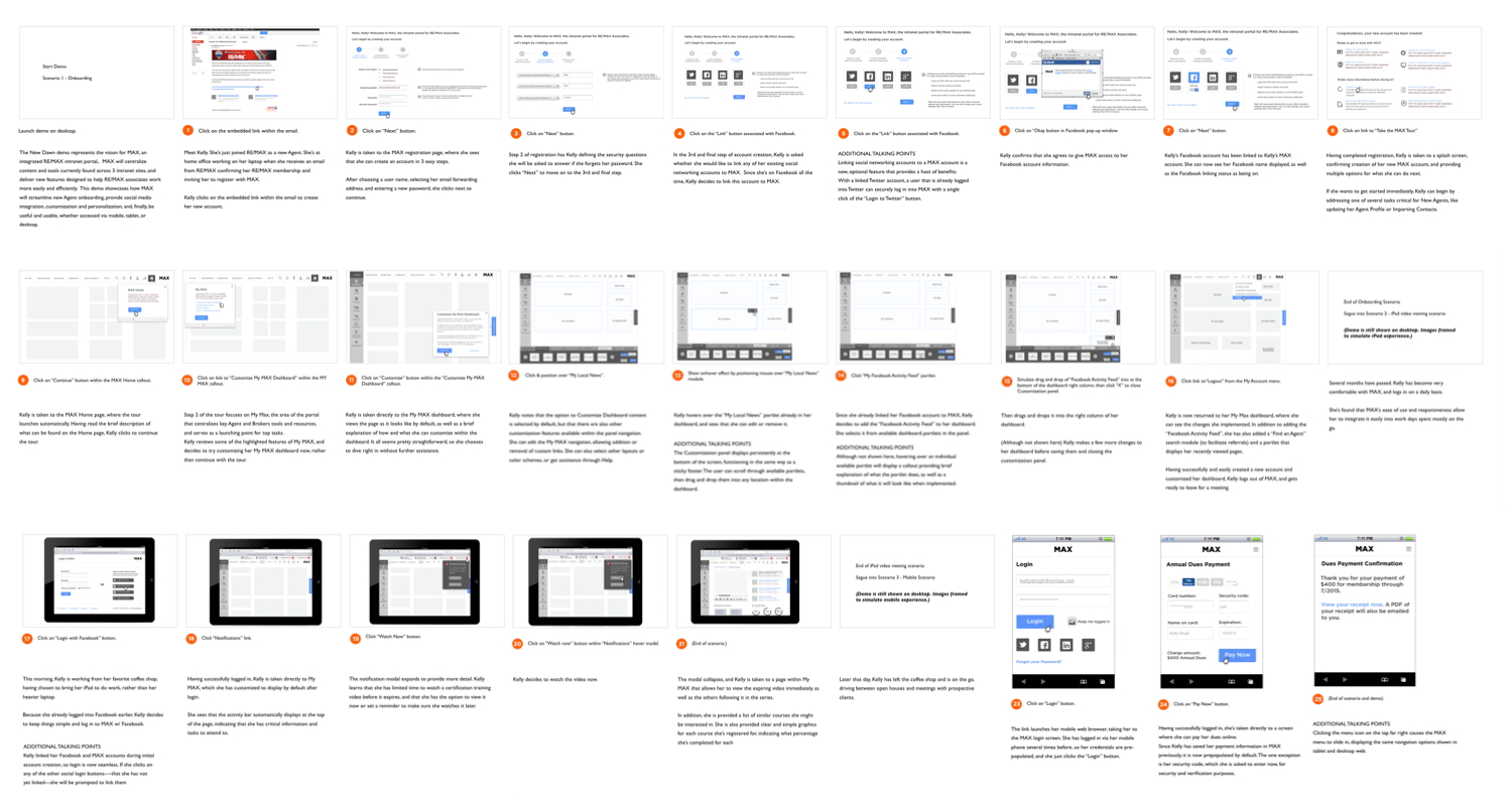
Our small team worked together to realize the final demo, a clickable, interactive prototype, together with presenter storyboard, script, and additional talking points, successfully presented to the RE/MAX executive team.
